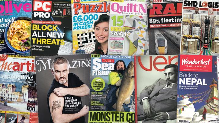
From Aesthetica to Yachting Monthly via When Saturday Comes and Warehouse & Logistics News, the Spotlight column has forensically examined magazine titles across consumer, business and customer publishing.
Like all good inspections, Spotlight arrives unannounced, and unless there is a specific query – usually about the numbers – the people who run the titles and put them together are not asked for their opinion. After all, they have hundreds of pages every year to have their say.
From newsstand circulations counted in hundreds of thousands to targeted business publications with discrete readerships, the titles are a publishing triumph.
The column has not been without its challenges, though. Here is what we have learnt so far. The format of the columns is retained for this piece and actual quotes that were used are like this in italics to illustrate the points.
WHAT’S IT ABOUT – Free thinking since 1913
If you have an esoteric title, have a quick explainer that will engage the casual reader: Apollo – ‘The international art magazine’
Other straplines and explainers tend towards the more promotional:
- The Cheapest and the Best
- Food magazine of the year
- Published since September 1843
- Free thinking since 1913
One favourite was the rather enigmatic strapline, ‘Packed with a great range of articles’, as if it wouldn’t be…
And another blurb on a website went above and beyond: “… a twice-yearly compendium of inspiration – for designers, for artists, for anyone looking for visual ideas; for anyone who loves fashion and design so much that they want to climb inside the heads of their heroes…”
VITAL STATISTICS – Commercially sensitive information
The section that has taken the most time, tact and even a few harsh words over the years. Size, paper weight, and price all reasonably straightforward, but, Ladies and Gentlemen, let me introduce you to… the circulation numbers.
It is easy to understand publishers being coy about exact circulations if they are not registered with ABC or do not feel it necessary to confirm audited figures. Reader and advertiser perception, competitor rivalry and old-fashioned pride all contribute to an opaqueness that is sometimes difficult to resolve.
Published ratecards and ‘advertiser information’ are a good place to start but can sadly be out of date and therefore unreliable. And, believe it or not, a direct approach to the editor or publisher can often result in, er, nothing.
One editor was good enough to respond but claimed that the circulation number was ‘commercially sensitive information’ but then objected when advised that phrase was to be used to explain the missing figures.
Among the published delights:
- No longer registered with ABC although website says it is.
- Claims a readership per year of 67,107,913 (yes, SIXTY SEVEN MILLION, that’s a Spotlight record).
So, when Spotlight comes calling, please be ready with an answer…
COVER - Beautifully constructed coverlines
“Remember, the cover is our face,” one venerable publisher used to say. “Readers can tell what’s going on inside your head by looking at your face.”
Some titles are confident enough in their distinctiveness that part, or in some cases nearly all, of the masthead is obscured. That’s all very well for subscribers, but on the newsstand, a game of ‘Fill in the missing letters’ can sadly result in a prospective purchaser moving on to something simpler to take in:
- Strangely blurry masthead that is difficult to make out.
- Classy masthead clumsily overlaid by 'FREE SEEDS' promo.
Then there are the coverlines and pictures which should lure the reader into the content:
- Beautifully constructed coverlines
- A rather confusing picture montage
- Tick boxes, stamps, spot varnish, holograms, exclamation marks
And please be sparing with punctuation, especially exclamation marks, which can have the opposite of the desired effect and make you look desperate, rather than cute or funny:
- Five! exclamation marks, two* asterisks and one £ sign.
- Eleven (or !!) exclamation marks – a Spotlight record!
CONTENT – All complemented by sumptuous advertising throughout
Some magazines have acres of space for content, others have to make every story and picture fight its way in. Either way, it’s crucial that readers know what’s coming and are able to navigate through the pages. The ‘Contents’ section takes many forms:
- Generously illustrated contents spread with clearly denoted page numbers.
- Two rather reserved contents pages divided into features, market and reviews.
- Find out what’s inside from page 001 to 068 in the contents spread on 004-005 (ok, you get the picture).
- Ingenious world map to show the international range of contributors * Imaginative use of the spine to detail contents
A little more effort is sometimes required: Contents divided into two of the dullest words ever, Features and Regulars.
‘Contents’ is invariably paired with words – wise, or otherwise – from the editor:
- Straight into dull editor’s letter (the letter, not the editor) on page three.
- First up is the ‘From the editor’ indulgence.
- Editor’s golden words, which start “Last issue I waffled on about…”.
Once inside, the content is invariably a delight, containing whatever passes for news in the target market, skilfully crafted features, sumptuous photography, enticing design and some surprises and delights:
- Four pages of letters (remember them?).
- Some natty hand-drawn graphics and lavish photography (check out the double-page spread of a nymph) make this a visually appealing mag as well as a detailed read.
- Also loved the writers’ competition. How chuffed the winners must be to see their well-crafted words so tastefully displayed.
- Enlightening ‘More from us’, which even includes a QR code for more details.
- ‘Rumours’ are just that and a brave play in this litigious world.
For the total package, the paid-for pages must play a part too:
- All complemented by sumptuous advertising throughout.
- The ads before the contents on page 7 - Tiffany & Co, Patek Philippe, Chanel and Dior - tell you everything you need to know.
DIGITAL – The advertised website doesn’t exist
There are some superb websites and social media offerings out there, but there is also evidence of muddled thinking about digital strategy and how what’s online works with what’s on paper.
Nearly every title has some sort of website presence, going from one miserly page with no meaningful offering except how to buy a subscription, through to a fully-functioning site with current content, archive material and even a turn-the-page magazine:
- Digital edition of the magazine available to download for smartphone and tablet.
- Readers photo albums, a well-populated forum and supplier info make the website a useful companion to the magazine.
- The advertised website doesn’t exist.
- The promoted website pings visitors into the proprietor’s main site.
Social media too often turns out to be an Achilles heel. Accounts set up in a wave of enthusiasm on Twitter and Facebook and more latterly Instagram and YouTube take a lot of looking after. Accounts which have little or no activity give the impression of an organisation not at the top of its game:
- Nearly 200k Twitter followers and a whopping 1.5 million Facebook likes.
- A monstrous 663k Twitter following and even more, 875k, likes on Facebook.
- Just 632 followers on Twitter, not surprising with no activity for nearly three years.
- An account that has been idle for five years.
- While the podcast is an innovative approach, nothing has been uploaded for a year.
It also helps when the digital media are used to their full potential allowing for involvement and interaction with users, who then feel useful and valued:
- Interesting content, such as competitions, rather than just plugs for the mag.
- Sign up for a newsletter
- Blogs, comments, tips and advice
Mind you, for some people, it’s just not happening: “We have explored digital in great depth, but it doesn’t actually work,” says the magazine’s managing director.
WHAT THEY SAY - We never publish poetry or fiction
If feedback is anything to go by, this is the most popular – or maybe notorious – section of the Spotlights. Highlighting indiscretions, hastily compiled social media posts or just clunky thinking, it pokes gentle fun at people on all sides of the publishing spectrum.
Some of the views are hidden in plain sight:
- "We had a digital version, but to be honest, it was boring, so boring," from editor’s letter.
- Editor-in-chief says: “We’re not the most app-tastic company in the world. I say: ‘Look, where’s the money in this?’”
- “The person who answers the phone to your query is likely to have a degree in history or archaeology, allowing us to engage with our highly loyal readers in an informed way” – no messing with those phone-answerers, according to publisher’s website.
- “…A high level of accuracy and attention to detail; A full, clean driver’s license (sic)…” from a job ad for circulation manager.
- “We never publish poetry or fiction,” – advice in Notes for Contributors.
The laws of social media mean that there is no distinction between the private and the professional, so always be careful what you put out there. And also remember you cannot shake off your digital past:
- “This is me! Hello!” – editor announces her arrival on Twitter in June 2015. The first of her four tweets in nearly three years.
- “Making a documentary about her genitals was never on Phoebe Hart’s to-do list.” So starts a series of three quick interviews with documentary makers. Of course, she does make that film…
VERDICT - Not just a magazine, more a way of life
The trick that many publishers strive to pull off is how to retain those ‘expert’ readers who know the subject inside out without putting off new readers, without whom growth either stands still or declines.
The ‘verdict’ section has detailed mostly successes:
- Feels like you’ve wandered into an exclusive club, but one that makes newcomers feel very welcome.
- While this is a serious magazine for committed enthusiasts, it is not daunting or off-putting for the mere amateur.
- Clearly designed and well-illustrated it will satisfy both the expert and beginner.
- Largely jargon-free for the lay readers.
But some seem happy with just the grown-ups:
- Detailed, serious and not for the dip-in.
- This is a serious offering not for the faint-hearted. Clearly knows its topic, and readers, inside out and aims high at the expert market.
- The prosaic headlines mark this out as a serious publication not to be messed with.
Overall, there is lots to admire about taking an individual approach:
- Looks and feels old fashioned, but who cares?
- Has the look and feel of a school textbook, imparting lots of information in a way that is easy to understand and quick to follow.
- The research detail of a PhD but a lively design flair makes this an approachable publication for mere mortals.
But there is pure joy in reviewing delightful titles:
- Difficult not to get carried away by the sheer professionalism, competence and confidence of this sumptuous magazine.
- Editor has chaperoned the magazine since its inception in 1993 – 26 years of writing, photography and love that shows through.
- This is a mind-bogglingly good magazine, compiled with competence and affection in equal measure.
And what greater epithet than this:
- A useful, cheerful and helpful publication.
- Not just a magazine, more a way of life.
This article was first published in InPublishing magazine. If you would like to be added to the free mailing list, please register here.


