We are absolutely focused on our digital present and future, but we still need to produce great-looking papers more cheaply for readers whose attention span is already more suited to Max Headroom blipverts.
Here’s a few things we’ve learned and tried at Johnston Press:
1. Reading behaviour is changing, like it or not
Some commentators (such as Nicholas Carr in his book, The Shallows) say research shows repeated use of the internet is changing the way we read, think and remember, actually hardwiring our brains differently. In print, that means skimming and scanning are becoming our preferred ways of gathering information.
That might be an extreme argument but there is something in it. We show a lot of eyetracking studies to our designers and editors and talk about how people actually read newspapers now (Norbert Kupper’s Newspaper Design and Reading Research, 2015, is a great one). Generally, the reader’s eye scans and skims, alighting on elements of interest before making a split-second decision to read on or, more likely, turn over. This happened pre-internet – now the scanning and skipping is getting much, much faster.
In print, most people only look at the pictures (especially faces), read the intro, the headlines, pull quotes or picture captions. Most people won’t invest time in reading thousands of words, unless they’ve got a real interest in that subject.
So, if you’ve got this far into this article, you’re already in a small minority. And if you read to the end, there’s a huge prize waiting for you*.
We all kind of know this, instinctively. The point is to react by using print design to grab eyeballs and slow people down so they engage.
2. Templates are the answer
We haven’t got the staff to design every page in our 180-plus newspapers. Who has these days?
Our central design team creates bespoke designs for 10 per cent, or less, of any paper’s pagination.
Templates, blank pre-designs where reporters write straight on to pre-drawn boxes and drop the headlines and pictures in, are the answer. Once you’ve switched to a template-driven content management system and started using templates, which remove the repetition (and the massive workload) of hand-drawn pages, you’ll ask yourself: “Why haven’t we always done this?”
Common template myths:
- “Templates are boring”. They could be – but when we jumped headlong into this in 2012-13 (and relaunched more than 150 newspaper titles), we got one of the world’s best newspaper design firms of the time, Cases i Associats, to do the creative work, establishing a design language, styles and rules from which our templating team created a library of template options.
- “Templates limit choice”. At the last count, we had more than 40,000 templates in our system – enough for pretty much every possible page presentation, picture shape, section, feature and story. As we update our products, we create more. We’ve learned a lot about how they work for the reader and how editors can create interesting newspapers without designing them from scratch every day.
3. Papers designed for audiences
Our design clusters were originally informed by data gleaned from Experian’s Mosaic profiling – each of our newspaper markets were assigned a reader profile, based on their most common consumer behaviours.
If you shop at Waitrose, drive a Volvo and live in a semi-rural market town in Lincolnshire, you’re most likely one of our Cluster 1 or Cluster 2 readers. Our Cluster 1 titles have classy serif headline fonts, restrained colour palettes and other design devices reminiscent of the quality national newspaper market. At the other end of the scale, our Cluster 5 titles have more shouty sans serif upper-case headlines, lots of tabloid red, higher story counts etc.
All of the clusters are built on the same page grids and use just two typeface families for everything (the body type is the same in more than 150 titles).
If, by some strange chance, you were a regular reader of both the Bucks Herald (Aylesbury) and the Northumberland Gazette (Alnwick), both beautiful Cluster 2 titles, you might notice they have exactly the same design and use the same page templates. But trust me, as long as the content is local and the paper looks right for its market, no-one notices.
Templates give us great efficiency, but they also drive consistency and quality.
4. Chunking out
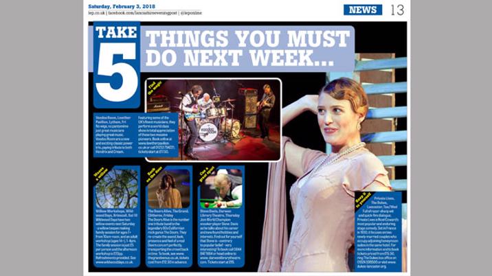
As we’ve evolved our templates and designed pages, we have developed new design clusters. More and more, these feature factboxes, sidebars, ‘in numbers panels’, quote boxes, breakdowns; an array of visual devices created to pull in the eyes, summarise for the ‘skimmers and scanners’ and improve retention. These devices score highly on those eyetracking studies.
Lots of studies show if you ask people to recall what they’ve read in a 1,000-word article, they will have retained less than if it had been presented as a list of bullet points, or a digest box.
If you’re still not convinced, try this: ask someone their phone number. Do they reply 078023254778? Or do they say 078 - 0232 – 54778? The three or four-number chunk is easier to remember than a 12-number string. It’s the same with lots of words and ideas.
The language of news on the web – listicles and briefings – is different to print and we need to be incorporating that into the way we tell news stories.
5. The news matrix and digest
Johnston Press acquired the i newspaper in 2016 and we’ve learnt a lot from them. The i continues to defy the downward dive of newspaper sales seen in the rest of the quality national market precisely because the paper specialises in short-form quality journalism. The pages of the i are peppered with ‘in numbers’ panels, briefings and breakouts.
The acme of this is the page 2-3 news matrix, a grid of nibs, short turn-in pieces, a graphic, a conversational briefing and the personable editor’s letter. This is a formula largely unchanged since the i’s launch, long before its Johnston Press days. The news digest page concept has been around a while (one of design guru Mario Garcia’s big ideas in the early 2000s) and it works. We have copied this in many of our city dailies and numerous weeklies.
Of course, not everyone is skimming and scanning all the time. There’s still a place for the long-form piece of great reporting or feature writing. The point is balance. Papers need to have a steady mixture of story lengths, short, medium and long throughout the book, a concept our designer friends at Cases i Associats call rhythm. Editors selecting templates (rather than designing the pages like they used to) need to give a rich variety of reading length.
6. Visual story telling
Of course, not everything can be presented on templates and there is still a place for design. Increasingly, our page designers incorporate the concepts of visual storytelling into the bespoke pages they create. This might mean using small graphics to break up text, or illustrating with charts, maps or drawn visuals to either summarise or explain. We use timelines in all sorts of formats, because readers respond well to reading a linear narrative, one chunk at a time.
We remember 80 per cent of information we read in picture form, as opposed to just 20 per cent of the words we read, so graphics and visuals grow more every day.
7. Changing the narrative
In many of our titles, we are changing the narrative flow by introducing Alternative Story Format templates (ASFs). These are story presentations which do not follow the traditional who-what-when-where-why-how structure we all learnt as reporters (remember the inverted pyramid?). Instead, they chunk out the story – an obvious example is the Q&A interview.
A typical ASF will have set-size boxes for the following: Here’s the issue – followed by a short summary; Here’s what we know – short summary; This is what happens next – short summary. This chunked-down template approach can be used for news follow-ups, story explainers and even council meeting reports.
We have ASF templates for number breakdowns for budget stories, opposing view columns, five things you need to know about… and more.
The point is to write – and be read – differently.
8. Sports fans want stats
Sport in local papers is about passion. Fans are hungry for the statistical minutiae about teams and players, as well as written analysis. We are incorporating many stats elements into our sports page designs, giving not only a rich reading experience but also visual variety and chunked-down narrative. One of our most talented page designers, Michelle Kilner, has made an artform of the player profile and match preview. We have taken the artistry of her spreads for Wigan Athletic and built these elements into templates for many other titles.
9. Front pages
Although we have front page templates, we believe the cover is still a key tool for attracting casual sale and insist on fronts being hand-designed by our central design team. We are constantly evolving front pages, taking inspiration from other newspaper groups and even other countries. From the digest format of the i to poster fronts, to web-tile-style presentations, we are trying a myriad of different approaches to attract the reader’s eye.
Again, the language of the web has taught us lessons – readers need to be enticed and intrigued by a front page write-off to turn inside and read on, just as web headlines tease and entice you in.
Today's newspaper market is more highly challenged than ever before and readers are constantly changing, but this offers more exciting opportunities for us to evolve and keep those readers coming back.
* The prize is getting to the end. Well done!


